Let's build the brand
together.
These guidelines help us define and build a consistent brand presence and experience across the world.
Download All LogosLogo
Logo variations
The logo combines the NEAR identity with House of Stake, highlighting a strong connection to the ecosystem.
Its form represents structured collective governance and transparent processes.

Primary Vertical logo
Minimum size
Digital 60px wide
Print 150mm wide

Primary Horizontal logo
Minimum size
Digital 200px wide
Print 50mm wide
Icon
Minimum size
Digital 32px wide
Print 8mm wide
Inverted

Inverted Primary Vertical logo

Inverted Primary Horizontal logo
Inverted Icon
Monotone

Monotone Black Primary Vertical logo

Monotone Black Primary Horizontal logo

Monotone Black Primary Horizontal logo

Monotone White Primary Horizontal logo
Clear Space
Our logo looks best when it has enough space around it.
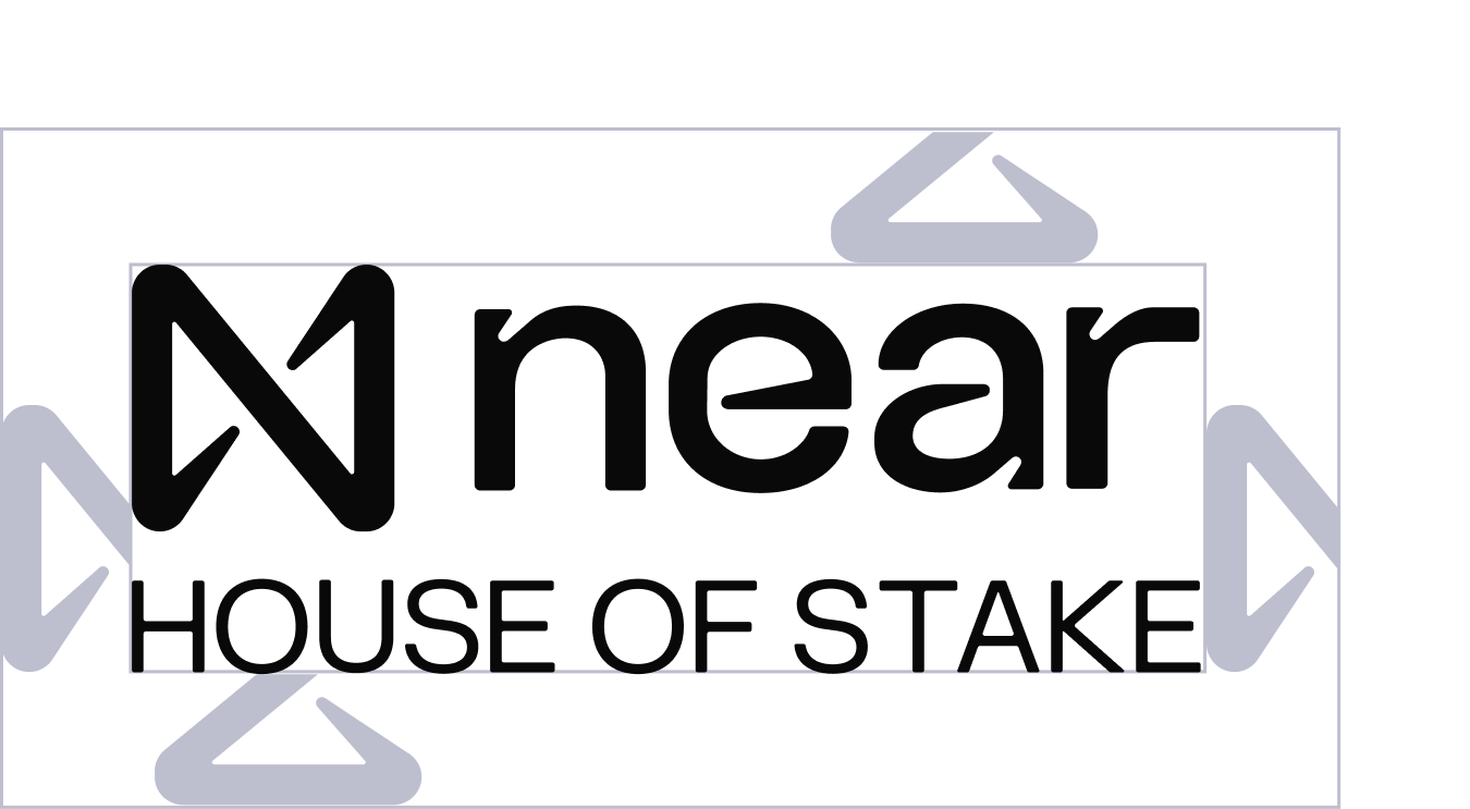
Logo
The NEAR House of Stake logo requires clear space between it and surrounding elements.
The minimum clear space on all sides is defined by ½ the width of the "N" in the brand icon.
Incorrect use
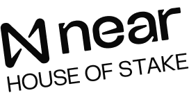
Do not place the logo on an angle
Do not stretch or warp the logo
Do not apply a drop shadow, stroke, or other visual effects
Do not place the logo on a low contrast background colour.

Do not use colours outside the brand guide approved colours

Do not change spacing, alignment, or relative locations of the design elements
Typography
Heading/Subheadings
FK Grotesk
Body Copy
FK Grotesk
FK Grotesk
FK Grotesk is our heading/display font, it comes in a full range of weights but we will use the bold primarily for its impactful effect.
ABCDEFGHIJKLMNOPQRSTUVWXYZ
abcdefghijklmnopqrstuvwxyz 1234567890
FK Grotesk thin
FK Grotesk light
FK Grotesk regular
FK Grotesk medium
FK Grotesk bold
FK Grotesk black
Arial Bold
Default font (when FK Grotesk isn't available)
Colour
Primary colour
Black
#000000
RGB 0 0 0
White
#FFFFFF
RGB 255 255 255
Coral
#FF7966
RGB 255 121 102
Colour contrast
